
Integrating Care.
Improving Lives.
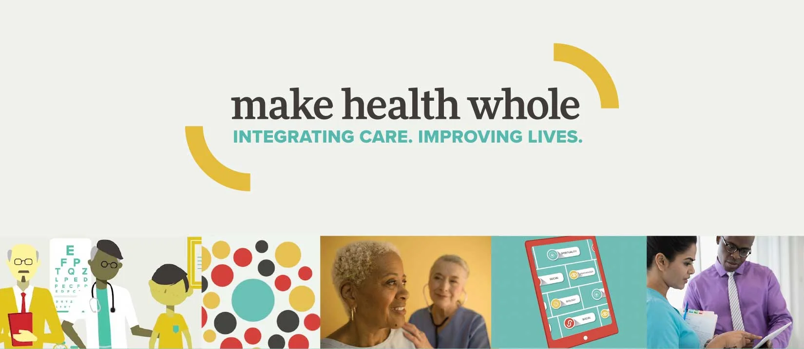
The Eugene S. Farley Center for Health Policy is tackling one of the critical challenges of our day — unmet mental health needs and stigma around the topic. To address this, they work to integrate behavioral health care into primary care settings, at all levels of the system from policy to practice. To activate stakeholders and act as a rally cry, we developed the communications platform, “Make Health Whole”.
The website highlights eight core “competencies” for integration through a series of live-action and animated videos, and acts as a hub for tools, resources, and progress in the field. Longer-term, the program aims to activate integration efforts among providers, insurers, policymakers, educators and philanthropies. Designed in collaboration with the team at Vermilion.
logo design | brand standards | animation art direction | web design

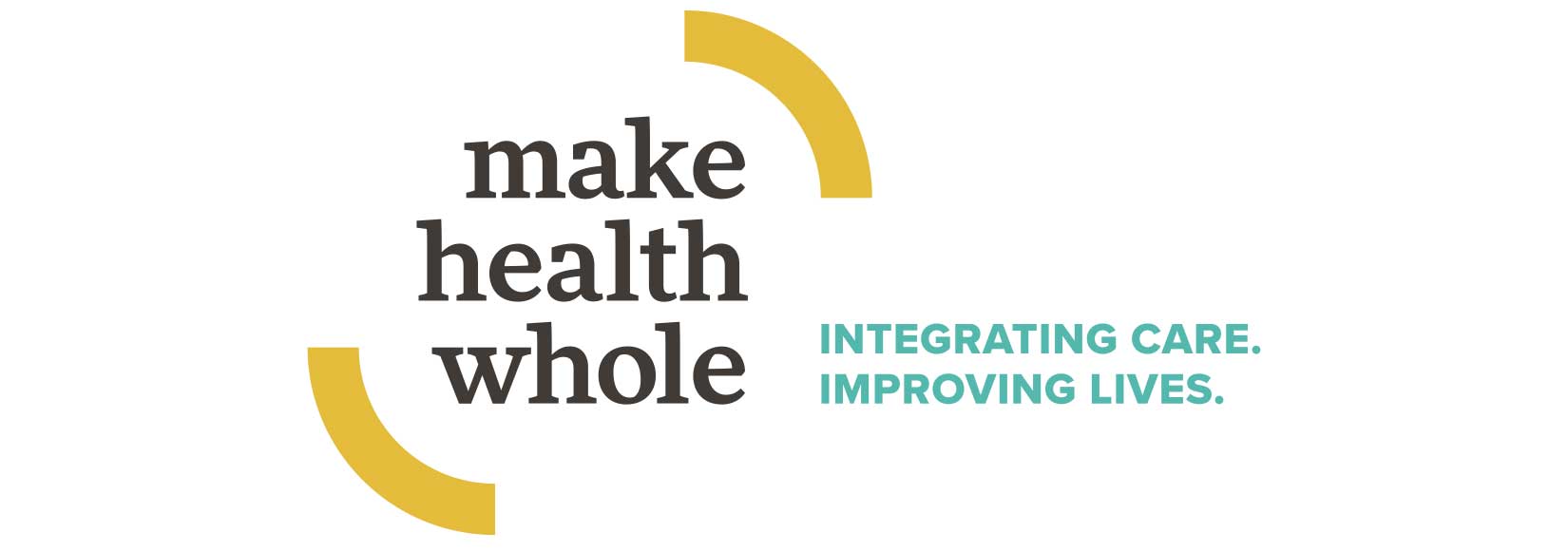
The Make Health Whole logo is comprised of a word mark set in lower case contained by two arched shapes. The lower case setting conveys approachability and accessibility, while the boldness and strong serifs emphasizes the power of the movement. The arched shapes are pieces of a circle, positioned in such a way as to communicate movement, containment, and expansiveness. Together, they make an emphatic invitation to join the movement and Make Health Whole.

Dominant use of teal blue makes a strong and optimistic statement. Blue is a calming color with strong associations to healthcare. Accents of tomato, mustard, and charcoal add bold freshness and distinction.

More Pro – Commanding and credible but approachable slab serif. Proxima Nova – Round geometric sans serif has a modern sensibility and communicates ease and clarity.